Understanding The New Lead Prosper Analytics
Lead Prosper is excited to introduce a new analytics dashboard that offers our users the ability to customize the look and feel of their analytics, save custom layouts and reports, organize and sort by any column, and review new analytical data points. The new analytics come on the heel of introducing our latest key feature to the platform, Returns. Now that users are able to process returned leads there needed to be new metrics and calculations and from that, the new Analytics dashboard was born.
Here are some key features that were added:
-
More Data Than Ever
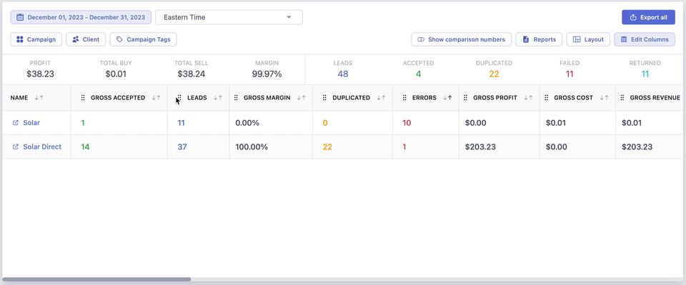
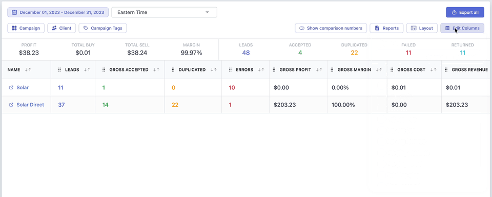
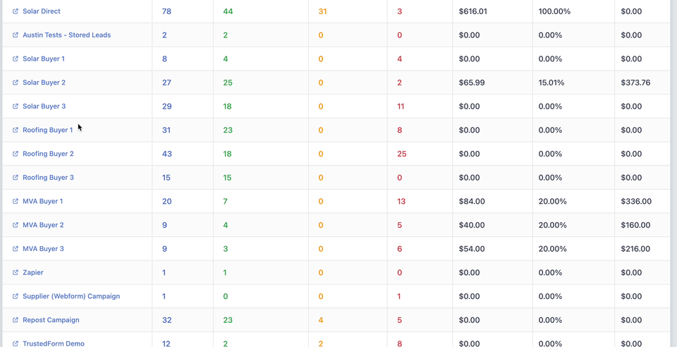
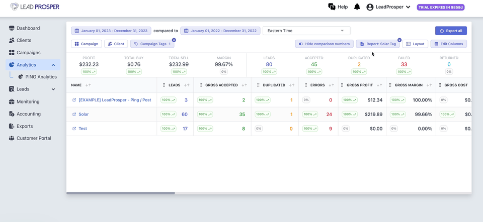
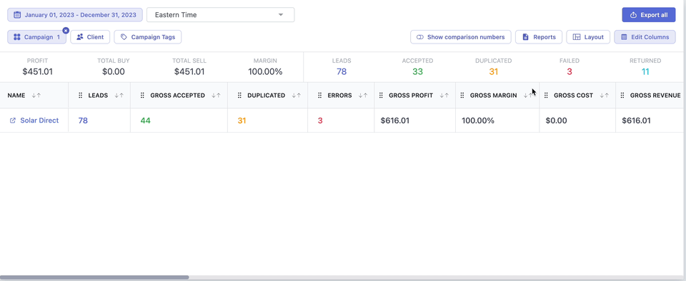
Our analytics dashboard now gives the ability to view over 25 key campaign metrics - lead totals, buyer / seller totals, gross & net profits, returned leads, ping and post metrics, and more!

-
Column List, Order, & Sorting
With all these new data points means an even more extensive column list, and with that we have added highly improved column organization. The Edit Columns list allows users to select or deselect which columns they want visible. Users now have the ability to easily drag and drop columns to change the sort orders, and users also have the
ability now to sort the analytics by any column. This allows for a truly customizable view of all data needed to best analyze and optimize your campaigns.
-
Layouts
Once you have your ideal column list, column order, and sort order set up you can then save the view as a Layout that can be used to easily change the display for the data set you are analyzing. Simply click Layouts and you can see a list of all of your saved layouts that will allow you to pull up your ideal view for your analytics.
-
Reports
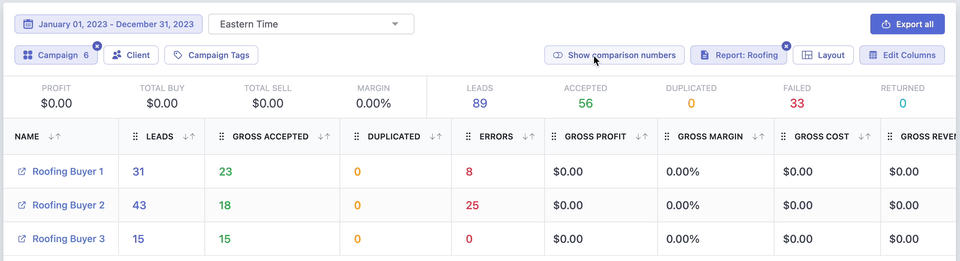
Users can now create reports that will allow the ability to display certain data based on the Campaign(s), Client(s), or Campaign Tag(s). Just like with Layouts you will be able to save different report types to easily pull up specific campaigns that you may be working on.
-
Comparison View
Users can now easily toggle on and off comparison metrics to have a visual indicator of data changes over a given period of time.
-
Campaign Modal
When viewing your analytics pages you can click on the Campaign itself to pull up a modal with even more granular analytical insights into your campaign. The pop up modal includes the same functionality as on the main dashboard, such as column list order and sorting, savable layouts, comparison metrics. When in the pop up a user can see a breakdown of all Suppliers and Buyers for that specific campaign, along with metrics for each. You’ll also be able to group the Suppliers and Buyers by Day or Month intervals, as well as by lp_subid1 or lp_subid2, or both.
If you set up a custom layout and save it, that layout will be considered your default layout that will be used when you browse other campaigns in analytics for the rest of your session, or until you change or deselect the layout.
-
Return Lead Data
The last big update to the Analytics are the introduction of data points related to the new Returns functionality. When you process a return all of the key data for that return will be updated in real time and be displayed for review in the Analytics. See metrics such as total returned leads, return amount totals, and the returns will also be taken into account in profit metrics and more.
Over the next few weeks we will be continuing to listen to customer feedback and applying fixes and changes to the analytics, so please reach out to support@leadprosper.io with any questions or feedback you may have to help us improve the analytics. Features that will be added in the near future include default layouts and reports, pre-built system reports, visual enhancements, and more, so please follow us and reach out if you have any questions or feedback.